This is a somewhat light module aimed at introducing a new member of the
family: datatool
We've already worked with drawtool and wordtool.
Drawtool is based on a popular Python graphing package
called Matplotlib:
Matplotlib is a powerful package for all kinds of plotting.
However, it can be difficult to understand how to use
effectively.
To simplify, we developed drawtool so that you can perform
both plotting and simple drawing.
Plotly is a recent competitor of Matplotlib:
Plotly is designed to be web-friendly, to let Python
programs have output that renders in a browser, so that websites
can display nice graphics.
Plotly has stronger support for maps (as in geographic maps)
than Matplotlib.
However, just like Matplotlib, it can be difficult to use,
especially since there are two fundamentally different kinds of maps.
Pandas is perhaps the most popular Python package
aimed at data handling and data science applications. It too takes a
while to learn.
Thus, to simplify, we have developed datatool, to
make it easy to do typical things like plotting graphs but also to
work with data files, and especially, maps.
Important: Datatool does not display via its own
GUI. Instead, datatool uses a browser, depending on whether you are
using Mac or Windows:
Mac/Linux:If
you don't have Firefox, you will need to
install
Firefox and have that running (open a tab to any webpage).
Windows: Your default browser will do.
Also, you will need to be connected (online) because
datatool downloads map data from certain websites.
2.0 Audio:
2.0 Getting set up for datatool
If you've downloaded Anaconda as directed earlier in the course,
you should already have Pandas and Plotly installed.
Let's give this a test.
Remember: To use datatool, you must follow the separate instructions
for Mac and Windows:
Mac users: you need to have Firefox running
and open to any page, such as this one.
If this did NOT work, then you will need to
install Pandas and Plotly via
Anaconda and use Spyder (instead of Thonny).
Note: you also need to be connected because datatool downloads
some map-drawing files from designated websites.
2.1 CSV data
When hearing buzzwords like "data science" or "data analytics", one
is led to ask: exactly what is meant by data, and what form does it
take on computers?
We need to be aware of two such forms:
One is the form it takes as a file.
The other is: how do we store it in our Python code?
Here are some basic types of data files:
Text data. This is just plain text but can be
found (and stored) as files of different kinds: Word files, plain
text files (as we've seen with our text examples), and webpages
(which contain text).
Here, the data is in plain text format, which means we can
use something like wordtool to iterate through words, letters etc.
Once we've read the words in the file, our program could store the
words in a list.
Numeric-only data. This kind of data is often
presented in plain text files:
Example: see this file, which
has pressure-difference readings from two weather stations in the
Pacific (it's called the Southern Oscillation, used to predict
El-Nino).
There's one reading for each month, a list of 12 numbers.
Numbers are often stored in arrays inside a program.
Image data. Images are stored in various formats
such as JPG or PNG.
But even more commonly, numeric and text data are often
found together, as in:
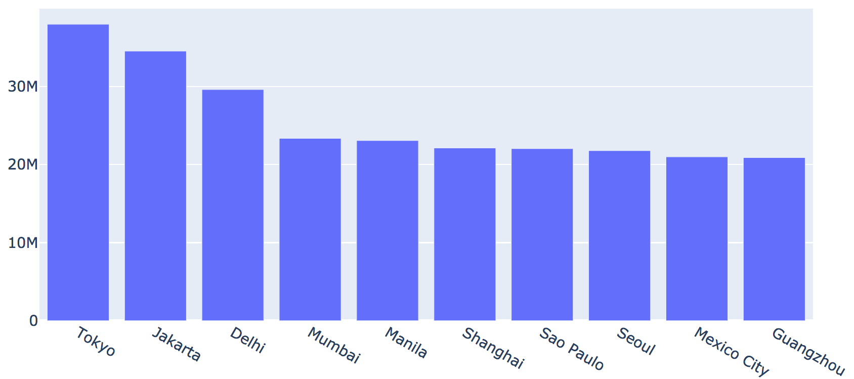
        city      lat      long       country iso2 iso3  population
       Tokyo  35.6897  139.6922         Japan   JP  JPN    37977000
     Jakarta  -6.2146  106.8451     Indonesia   ID  IDN    34540000
       Delhi  28.6600   77.2300         India   IN  IND    29617000
      Mumbai  18.9667   72.8333         India   IN  IND    23355000
      Manila  14.5958  120.9772   Philippines   PH  PHL    23088000
    Shanghai  31.1667  121.4667         China   CN  CHN    22120000
   Sao Paulo -23.5504  -46.6339        Brazil   BR  BRA    22046000
       Seoul  37.5833  127.0000  Korea, South   KR  KOR    21794000
 Mexico City  19.4333  -99.1333        Mexico   MX  MEX    20996000
   Guangzhou  23.1288  113.2590         China   CN  CHN    20902000
This type of table-like format is possibly the most common type of data.
While one could store this in a plain text file as in
this example, it is much more
convenient to use the CSV format.
For the above example, this is the
CSV file, which you can store and open in Excel or Google-sheets.
You can see why CSV stands for "Comma Separated Values".
Next, let's write some code to work with CSV files.
from datatool import datatool

dt = datatool()
dt.load_csv('cities.csv')
dt.print_data()
2.2 Exercise:
First, download cities.csv.
Then, type up the above in
my_data_example.py
and confirm that you see the same data printed out. You will notice
an additional "row number" column as the first column.
It is often convenient CSV data into an array, as in this example:
from datatool import datatool

dt = datatool()
dt.load_csv('cities.csv')

D = dt.get_data_as_array()
print(D)
2.3 Exercise:
In
my_data_example2.py,
add code to print the average city population using these 10 cities.
You should get 25643500.00 (larger than the third most populous
U.S. state).
2.2 Using datatool for plotting
Often, one of the first things we do with data is to plot the data,
or at least parts of it.
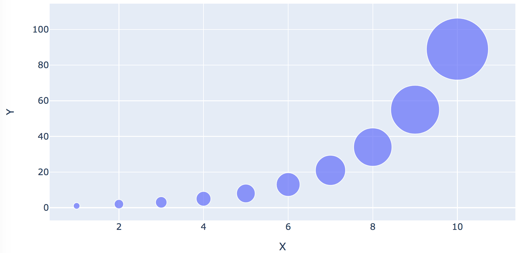
With datatool, that is as simple as this:
from datatool import datatool

dt = datatool()
dt.load_csv('simpledata.csv')

# A basic line graph. 'X' and 'Y' are the column headers.
dt.line_graph('Y', 'X')

dt.display()
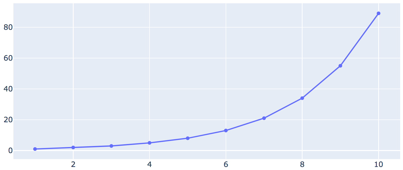
Let's examine the data:
The CSV file looks like this:
X,Y
1,1
2,2
3,3
4,5
5,8
6,13
7,21
8,34
9,55
10,89
This is merely a list of points with x,y coordinates.
2.4 Exercise:
In
my_plot_example.py,
plot 'X' against 'Y' to get
Note: Mac users: don't forget to have Firefox running before
you run the program.
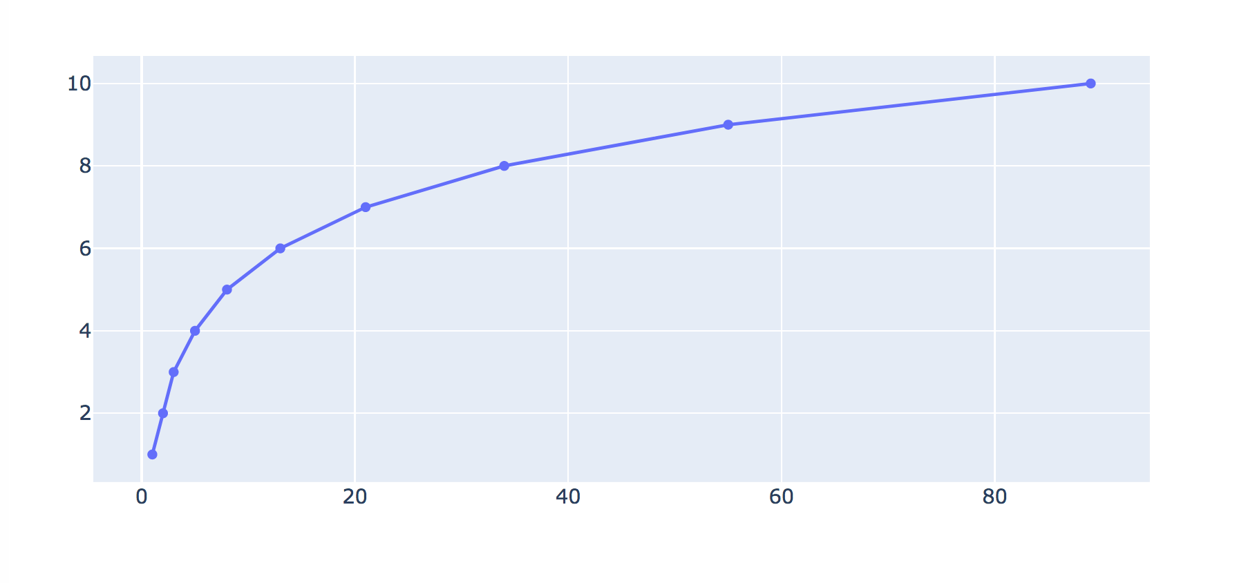
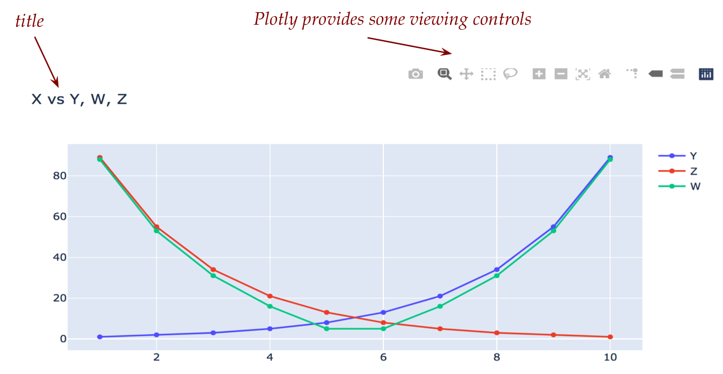
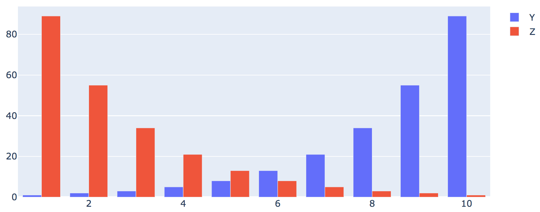
One can plot categorical (non-numeric) data as well:
We will plot the 2nd, 3rd, and 4th columns against the 1st:
from datatool import datatool

dt = datatool()

dt.load_csv('simpledata2.csv')

# Note: how to place a title on a graph:
dt.set_title('X vs Y, W, Z')

dt.line_graph('X', 'Y')
dt.line_graph('X', 'Z')
dt.line_graph('X', 'W')

dt.display()
Notice that when Plotly (via datatool) displays in the
browser, there are additional controls included, such as zoom
in/out:
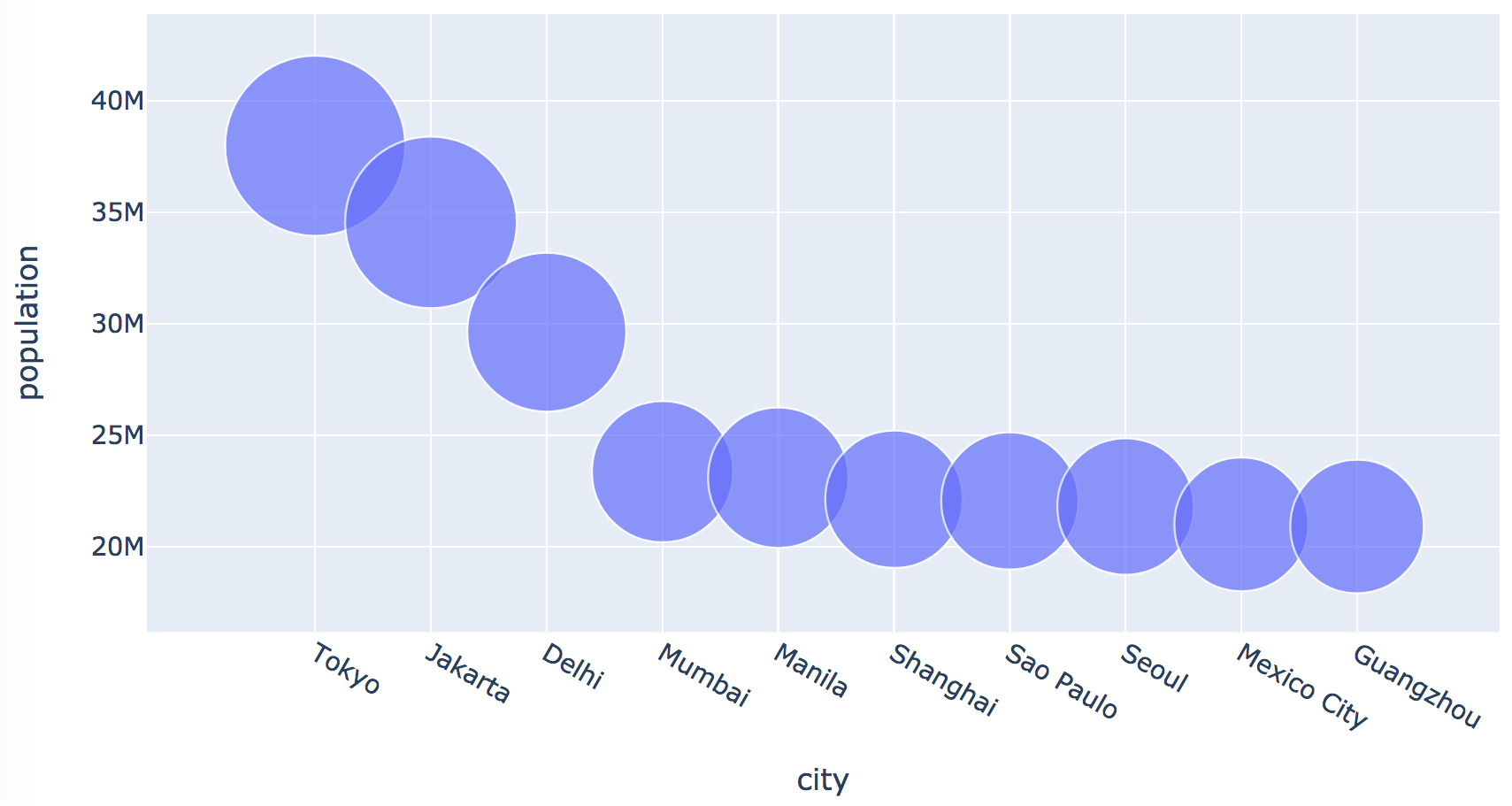
We need to tell datatool which column to use for the size of
the bubbles.
It is possible to use one column for the center of each
bubble (as if plotting points) and another for bubble sizes.
2.7 Exercise:
In
my_plot_example4.py,
use the cities.csv dataset to plot a bubble chart of city populations
as in:
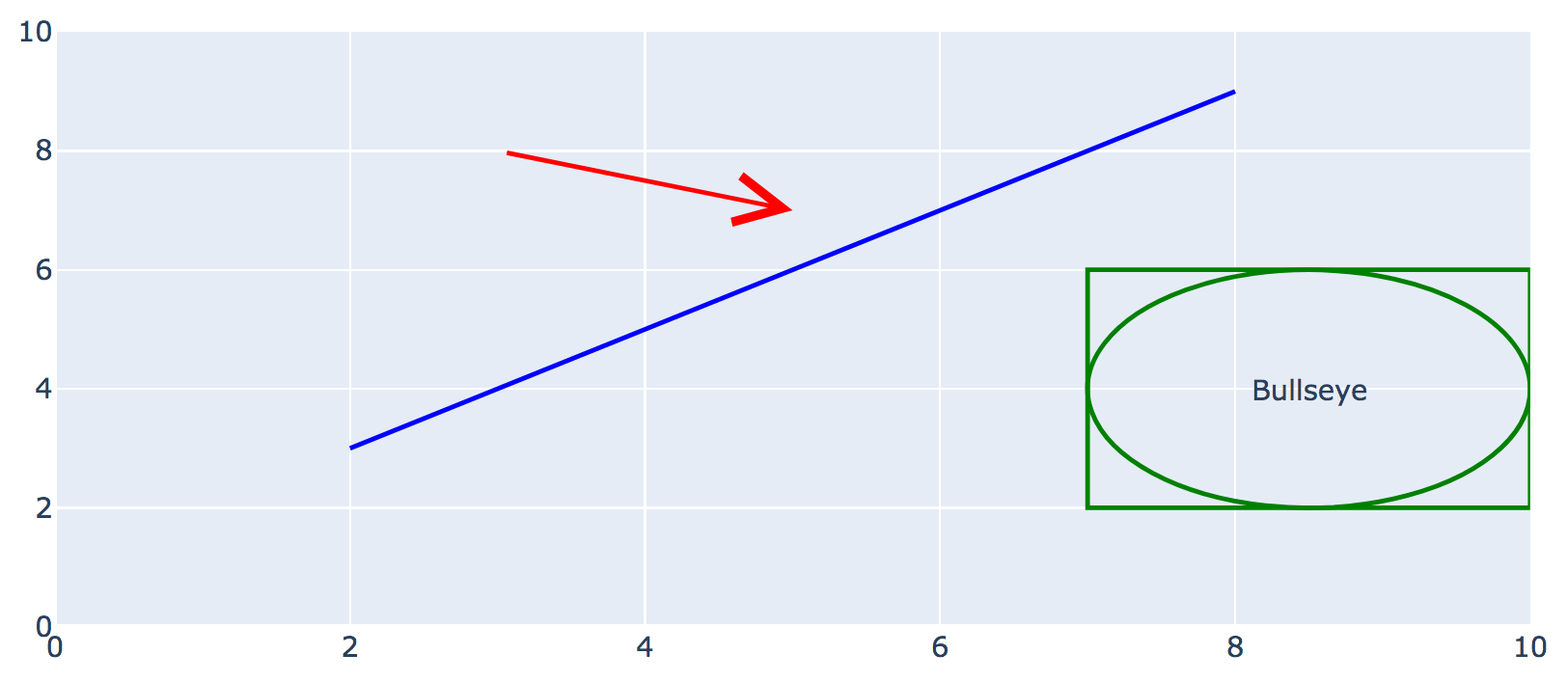
2.3 Using datatool for drawing
Datatool as drawing functions similar to drawtool:
from datatool import datatool

dt = datatool()

# Set the range along each axis:
dt.set_x_range(0, 10)
dt.set_y_range(0, 10)

# Set line width:
dt.set_draw_width(2)

# Draw some lines and shapes
dt.set_draw_color('blue')
dt.draw_line(2,3, 8,9)
dt.set_draw_color('green')
dt.draw_rectangle(7,2, 3,4)
dt.draw_ellipse(7,2, 3,4)
dt.set_draw_color('red')
dt.draw_arrow(3,8, 5,7, 5, 2)

# Draw text
dt.draw_text(8.5, 4, 'Bullseye')

dt.display()
Which produces
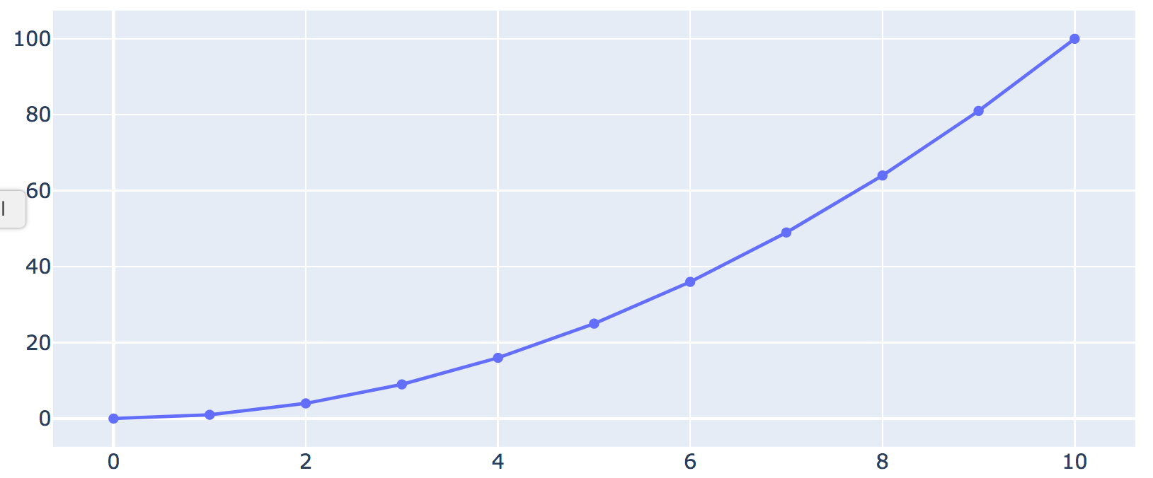
2.4 Using datatool with generated data
In some situations, we end up generating data with
our code. This means the data is not in some CSV file.
For example, suppose we want to plot the numbers 0 through 10
and their squares using:
for i in range(11):
    x = i
    y = x * x        # The square of x

# We'd like to plot these x,y values as points in a graph
There are two options:
Create a CSV from the above program, and then load that into
datatool.
Avoid creating a file and directly feed the data into datatool.
Let's use the latter approach since it avoids having to create a file.
from datatool import datatool
import numpy as np

dt = datatool()

# Make an empty array with zeroes (dtype='f' means float numbers)
# Other kinds are 'int'
A = np.zeros( (11, 2), dtype='f')

# Now fill the array with generated data:
for i in range(11):
    x = i
    y = x * x
    A[i,0] = x     # First col has x
    A[i,1] = y     # Second has y

# We now want to plot the second column in A against the first

# Hand the array over to datatool, specifying column names:
dt.set_data_from_array(A, col_headers=['X','Y'])

dt.line_graph('X', 'Y')

dt.display()
Which produces
Note:
Notice how we ask Numpy to create an array of the right size:
A = np.zeros( (11, 2), dtype='f')
That is, 11 rows for the numbers 0 through 10 and
2 columns for the x,y values.
Notice that (11, 2) is specified as a tuple.
(Recall tuples from Module 1 of this unit.)
The array A now has 11 rows and 2 columns, with each entry
set to 0.
After that, we fill in the values we generate:
for i in range(11):
    x = i
    y = x * x
    A[i,0] = x
    A[i,1] = y
Which we could shorten to:
    A[i,0] = i
    A[i,1] = i * i
The CSV equivalent (which we don't need here) would look
like this:
One of the more exciting uses of Plotly is to display maps
and draw on them.
Let's think about what a map really is:
Whereas a standard 2D plot depicts an x-axis and a y-axis,
a map could be a region of the globe or the whole globe
forced into 2D depiction (sometimes awkwardly).
The coordinate system uses angles
called latitudes and longitudes.
There are fundamentally two types of digital maps:
A vector map or line map is a collection of
lines and other such geometric entities which, if drawn like lines
typically are, will show a map.
A vector map is most often a very basic map with simple lines
for boundaries.
Vector maps are efficient because it doesn't take much
storage space to store lines (you only need the coordinates of the
end points of each line).
A tile map is really a collection of tiles
put together to form a map:
An individual tile can itself be an image (as in a 'satellite
view') or a combination of image and geometric objects.
Tilemaps generally look nicer because tiles can be pre-built
with accurate and rich detail.
However, detailed tiles can be slow to load, as you've no
doubt notice when zooming quickly with Google-maps.
Because of these and other differences, map drawing can sometimes be confusing.
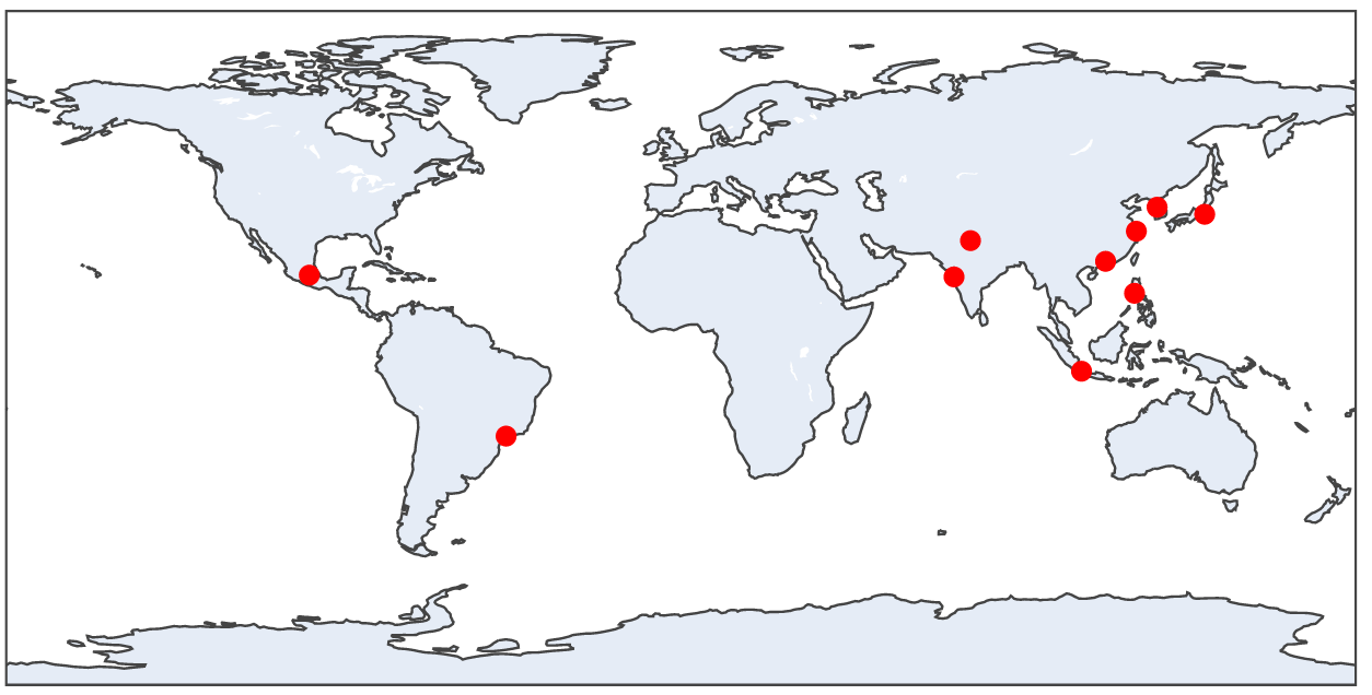
Let's look at an example of a simple line-map:
from datatool import datatool

dt = datatool()

dt.load_csv('cities.csv')

# We need to specify which columns of cities.csv have
# the latitude and longitude, respectively.
dt.linemap('lat', 'long')

dt.display()
2.8 Exercise:
You already have cities.csv. Type up the above in
my_linemap_example.py
and confirm that you see
Note:
You need to be connected to the internet because datatool
downloads map data from certain websites.
You may see an "Aa" legend by the side, depending on which
version of Plotly was installed by Anaconda.
The columns that have the latitude and longitude happen to
be called
lat
and
long.
Which is what we need to tell datatool:
dt.linemap('lat', 'long')
Datatool then (via Plotly) draws a world map as default with one red
dot per latitude-longitude pair extracted from those columns.
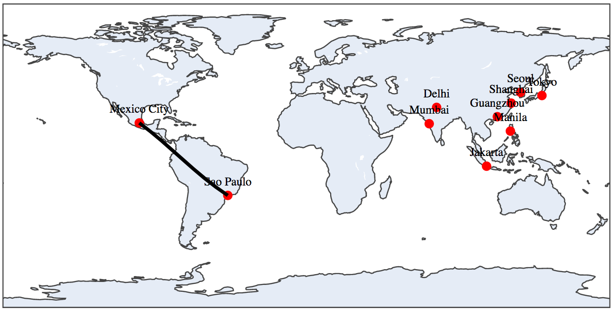
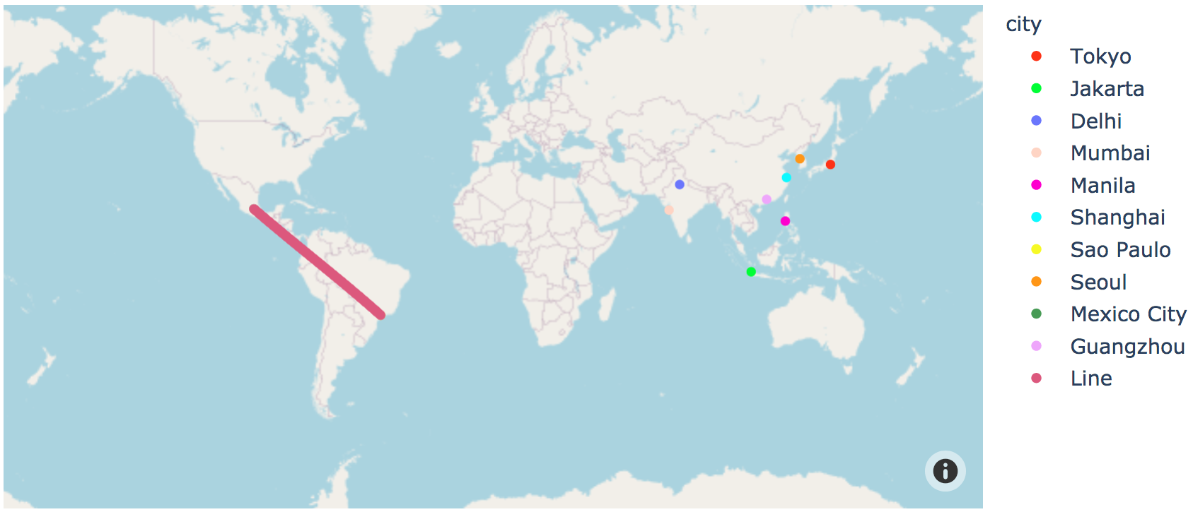
Next, let's label the cities and draw a line:
from datatool import datatool

dt = datatool()

dt.load_csv('cities.csv')

dt.linemap('lat', 'long', 'city')

# This needs to come after the linemap() function call.
dt.linemap_add_line(-23.5504,-46.6339, 19.4333,-99.1333)

dt.display()
2.9 Exercise:
Type up the above in
my_linemap_example2.py
and confirm that you see
Note: the city labels are crowded and overwrite each other in places.
In general, map labeling is a challenging issue.
There is a more detailed version of linemap drawing that allows
one to set the size of labels (markers), create "hover" text, and so on:
A choropleth
map
shows regions in colors that imply a quantity associated with a region.
Datatool displays choropleths using linemaps.
For example, let's show country populations from our running
example in a choropleth map:
from datatool import datatool

dt = datatool()

dt.load_csv('2011_population.csv')

# Changes the colorscale of the choropleth_iso3()
dt.set_color_scale('rainbow')
# More choices here: https://plotly.com/python/builtin-colorscales/

# The choropleth_iso3() function uses a standard code for countries.
# The second parameter describes which column to use for heat-map
# like coloring. The third is what to show when the mouse hovers.
dt.choropleth_iso3('countrycode', 'pop', 'country')

dt.display()
Which produces:
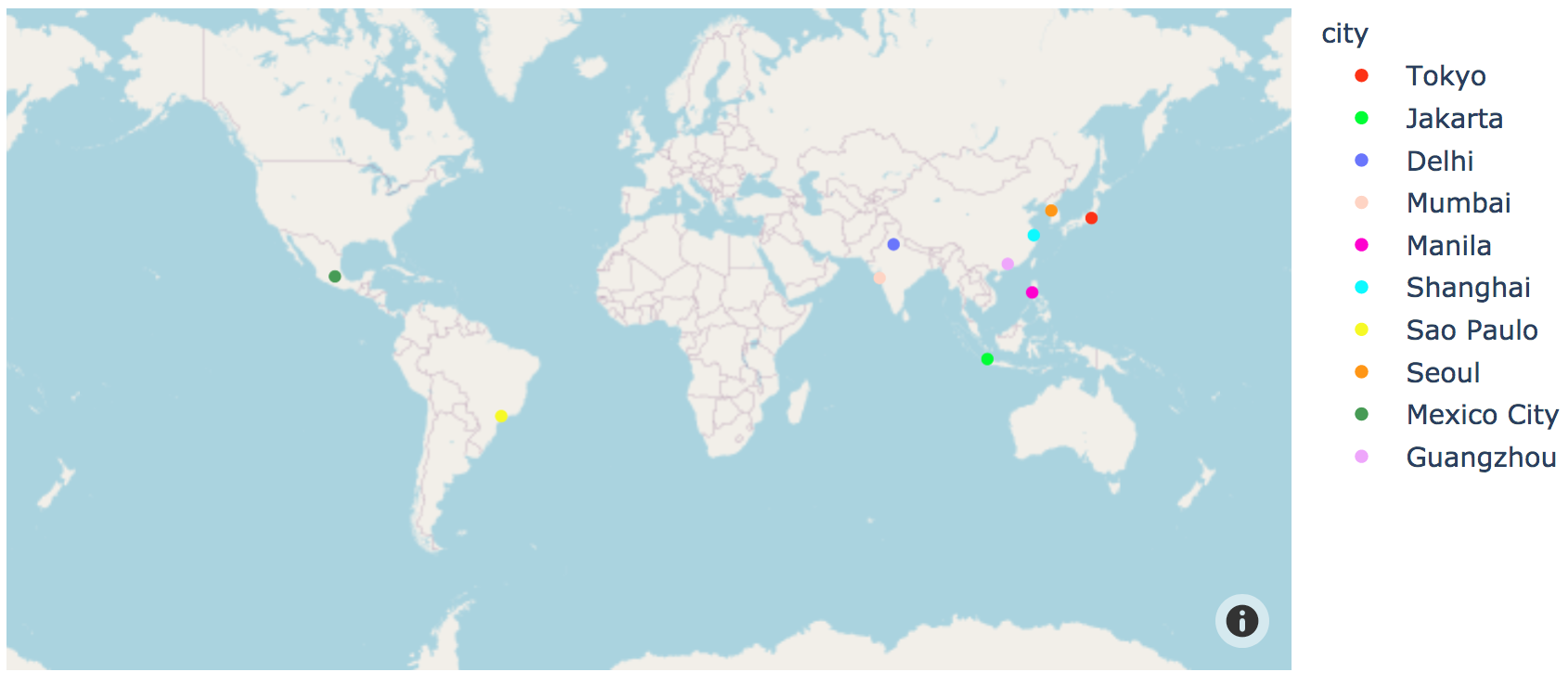
2.7 Using datatool for maps: tilemaps
Let's look at our 10 cities using a tilemap:
from datatool import datatool

dt = datatool()

dt.load_csv('cities.csv')

# The first two identify the lat/long columns. The third
# is the column with the data to be drawn.
dt.tilemap_attach_col_lat_long('lat', 'long', 'city')

dt.tilemap()

dt.display()
Note:
For tilemaps, we first need to identify the columns
that have the latitudes and longitudes, along with the "data"
column.
The data column has the strings that we want shown at those
latitudes and longitudes.
2.10 Exercise:
Type up the above in
my_tilemap_example.py
and confirm that you see
Now let's draw a line between two cities:
from datatool import datatool

dt = datatool()

dt.load_csv('cities.csv')

dt.tilemap_attach_col_lat_long('lat', 'long', 'city')

# For tilemaps, line drawing must precede the call to tilemap.
dt.tilemap_add_line(-23.5504,-46.6339, 19.4333,-99.1333)

dt.tilemap()

dt.display()
2.11 Exercise:
Type up the above in
my_tilemap_example2.py
and confirm that you see
The above shows the full world map centered at latitude 0, longitude 0.
A more detailed version of the tilemap function allows you to set the
zoom and center, among other items:
dt.tilemap_attach_col_lat_long('lat', 'long', 'city')

# Define a different center:
c = dict(lat = 30, lon = 120)

# The detailed version specifies hover data, the center, a zoom level
dt.tilemap_detailed(hover_name='city', hover_data=['city'], center=c, zoom=2, title='Some cities')
There is also an intermediate-detail version with just
center, zoom and title:
dt.tilemap_attach_col_lat_long('lat', 'long', 'city')

c = dict(lat = 30, lon = 120)

# Intermediate-detail: center, zoom, title:
dt.tilemap_czt(center=c, zoom=2, title='Some cities')
Finally, let's look at an example with street maps,
where tilemaps really stand out:
