Begin by locating a graphing utility that you can use for this lab. On a macintosh, you will find Grapher.app in the Utilities subfolder of the Applications folder. On a Windows machine, you can use google to find something you like. It's conceivable that you might like using the graphing capabilities in a spreadsheet program like Excel. Whatever you use, make sure your program can create graphs in a format that you can send to the lab instructor.
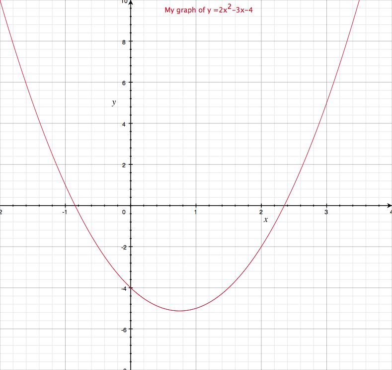
To make sure you've got the idea behind how to use your graphing program, try your hand at:
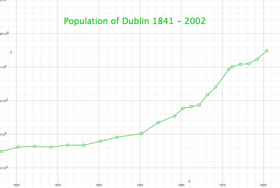
Now let's see if we can plot a set of points. Here is a table of the population of Dublin from 1841 to 2002:
| 1841 | 372773 |
| 1851 | 405147 |
| 1861 | 410252 |
| 1871 | 405262 |
| 1881 | 418910 |
| 1891 | 419216 |
| 1901 | 448206 |
| 1911 | 477196 |
| 1926 | 505654 |
| 1936 | 586925 |
| 1946 | 636193 |
| 1951 | 693022 |
| 1956 | 705781 |
| 1961 | 718332 |
| 1966 | 795047 |
| 1971 | 852219 |
| 1979 | 983683 |
| 1981 | 1003164 |
| 1986 | 1021449 |
| 1991 | 1025304 |
| 1996 | 1058264 |
| 2002 | 1122821 |
Source: Central Statistics Office, Skehard Road, Cork, Ireland.
You should be able to graph these points, to look something like this
This should be a quick and easy exercise.